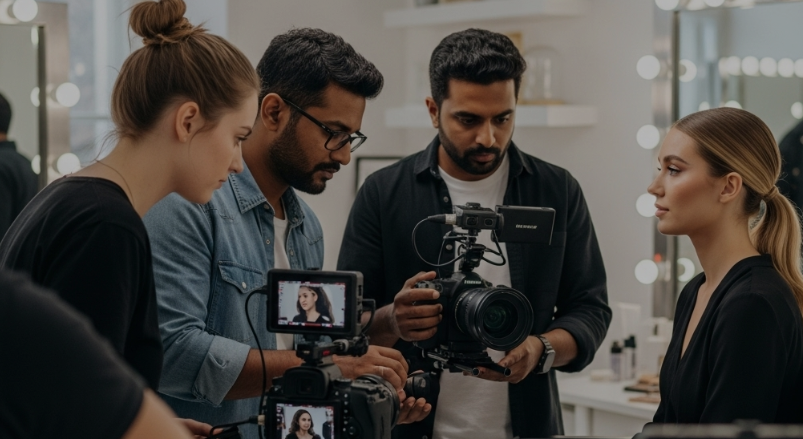
Product First, Story Always: How to Animate Presence
Craft beauty product motion visuals that tell your skincare brand story with quiet presence, minimal CTA, and product-led animation that holds the viewer.
10 Jul'25
By Niharika Paswan

Product First, Story Always: How to Animate Presence
In a world flooded with motion, stillness stands out. But when it comes to showcasing a beauty product especially in a digital feed, movement is often what earns attention. The real challenge? Making that movement feel quiet, intentional, and brand-aligned. This is where presence comes in.
Presence isn’t about loud graphics or elaborate effects. It’s about giving the product space to breathe, time to register, and weight to anchor itself in the viewer’s mind. When done right, motion visuals don’t distract they elevate. They let the product sit alone in the frame and still hold the stage.
At the heart of this shift is a principle that today’s most design-forward beauty brands are leaning into: product first, story always. Here’s how that approach shapes motion, tone, and CTA strategy and why minimal doesn’t mean passive.
Why the Product Alone in Frame Works Now
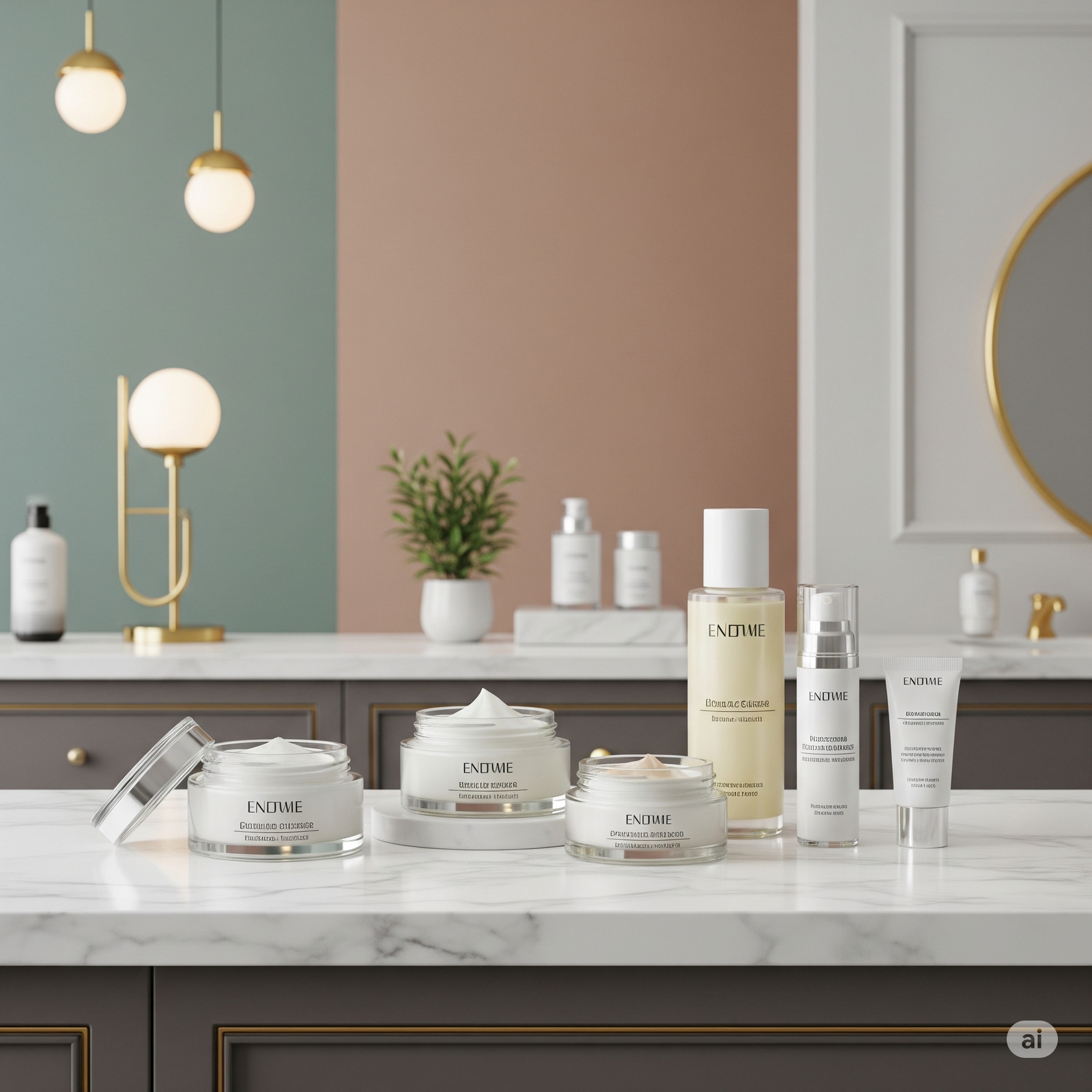
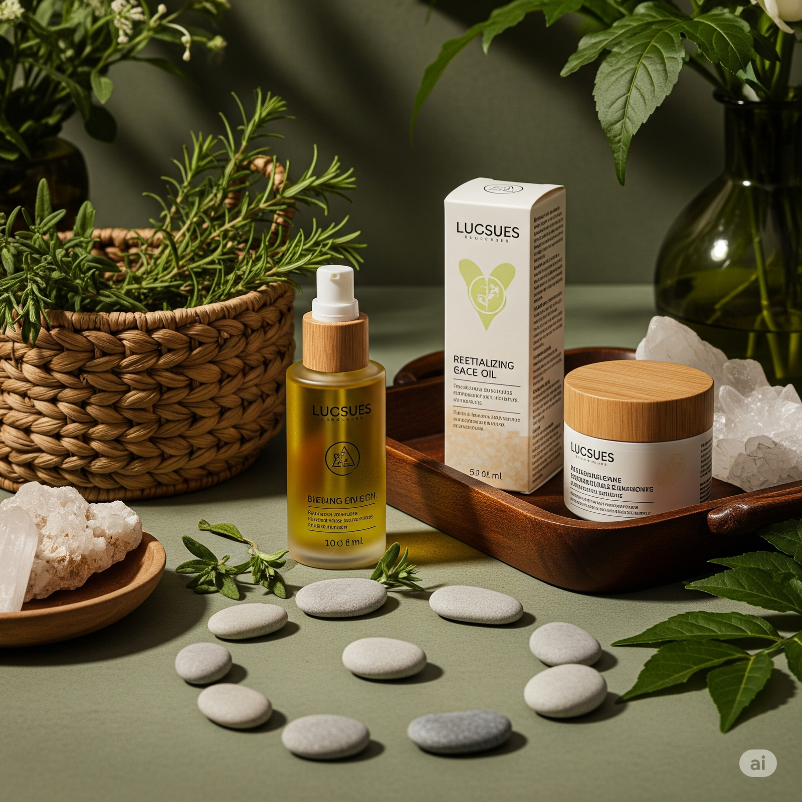
In an age of crowded storytelling, a product shown alone and not held, not modeled, not surrounded by lifestyle props, can feel like a breath of fresh air. But that simplicity has to do more than just look clean. It has to create presence.
When a product stands alone in frame, it becomes the subject and the statement. There’s no clutter to lean on. Which means every decision from how the light catches the cap to how the camera pans across the label becomes meaningful.
This kind of visual demands restraint. The background is often flat, the palette neutral, and the motion slow. But the result is confidence. When a skincare brand tells its story through minimal frames, it signals clarity. Trust. And a sense that the product can hold its own.
In a scroll, this is surprisingly disruptive. A gentle product spin, a soft texture reveal, a quiet pour, they stop the thumb not by shouting, but by anchoring.
Tone: The Quiet Power Behind Presence
Motion alone isn’t enough. Tone gives it depth. And in the context of beauty, tone isn’t just about voice, it’s visual behavior.
Is the product moving fast or slow? Is it centered or slightly off-balance? Are the shadows soft and warm, or crisp and cold? These aren’t just aesthetic choices, they communicate the brand’s identity.
For example:
- A luxury skincare brand may use minimal motion with velvety lighting and near-static framing to evoke calm and indulgence
- A clean beauty line might animate its product with natural light leaks, organic tilt-ins, and airy space to reflect purity
- A clinical brand could lean into sharper movements, precise angles, and crisp white to signal efficacy
The tone in beauty product motion visuals is doing a lot more than just making something look “nice.” It’s telling a story about values. And when done with intentional restraint, that tone speaks louder than any voiceover ever could.
Story Without the Sell: Why Minimal CTA Matters
Traditionally, video content in beauty was layered with cues such as: “shop now,” “watch full routine,” “link in bio.” But in a new wave of brand visuals, those calls to action are fading into the background. Or disappearing entirely.
Instead, the product visual becomes the story. And that story doesn’t end with a CTA, it lingers in the mind.
Why is this effective?
Because modern beauty shoppers aren’t impulse buyers. They’re experience-seekers. They want to feel the brand, not be pushed by it. A minimal motion piece, with the product at center, often does more to spark curiosity than a loud sales cue ever could.
In this structure:
- The product is revealed through motion
- The story is implied through tone
- The next step is left unspoken
And yet, it works. Because the presence created is strong enough to earn memory. In beauty marketing, that’s half the battle.
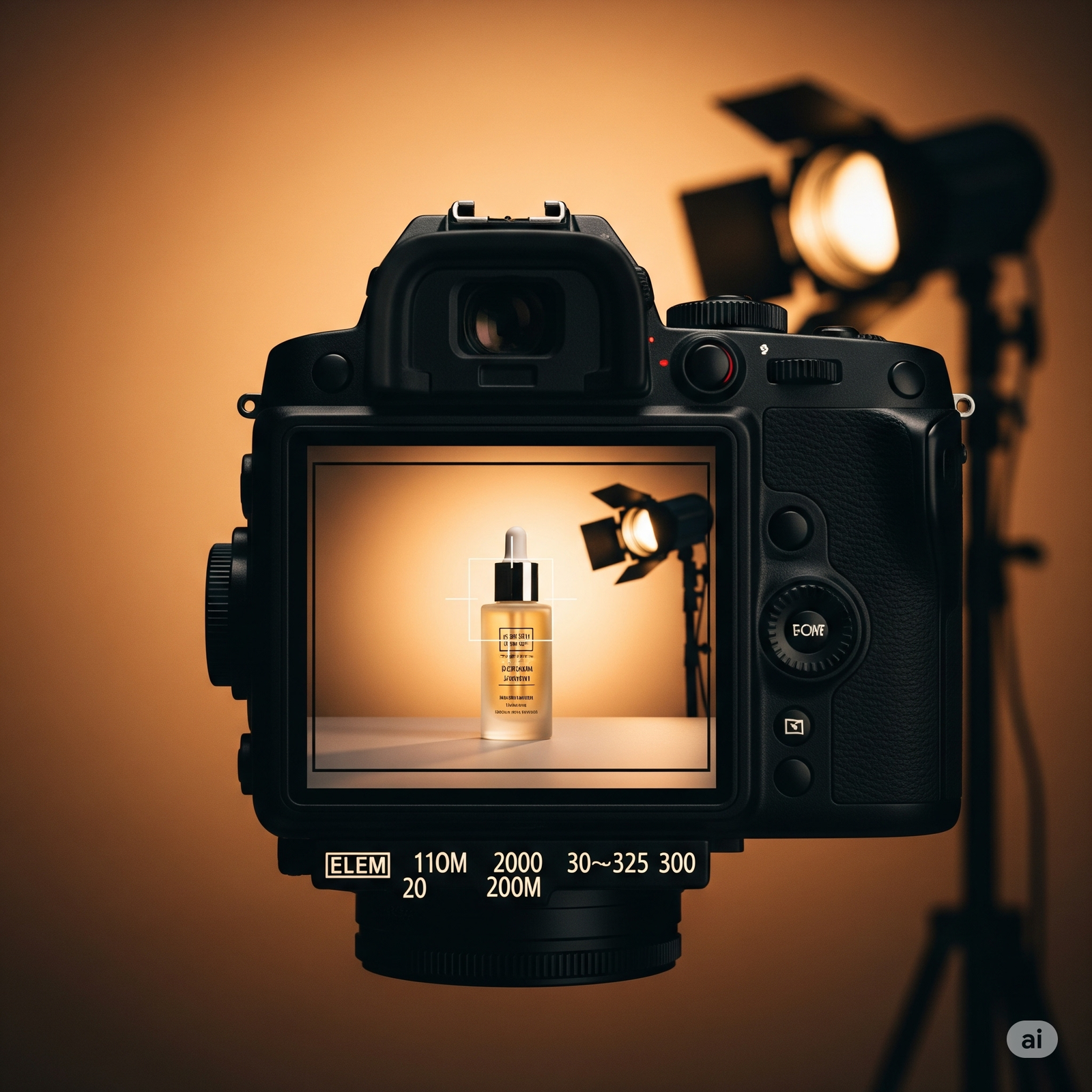
Motion That Honors Materiality
One of the key elements in animating presence is capturing the texture, finish, and weight of the product in motion. A bottle that feels too light on screen can come across as cheap. A jar that spins too fast might lose its sense of luxury.
Instead, thoughtful motion respects materiality. It lets a glossy serum tube catch the light slowly. It allows a cream jar to settle into the surface with a slight bounce, just enough to show weight.
These cues are subtle, but they tell the viewer something about the formulation before a single word is read. They whisper: this product is considered. It has weight. It belongs.
This is where the beauty product motion visual becomes more than marketing. It becomes sensory storytelling.
Presence Is Built on Pacing
Pacing in animation is often underestimated. But in minimal visual storytelling, it’s everything.
Too fast, and you lose presence. Too slow, and you risk losing attention. The sweet spot is where pacing feels natural, as if the product is revealing itself at its own rhythm, not the editor’s.
This pacing aligns with how we want beauty to feel in real life: unhurried, thoughtful, sensory. When the animation moves with that rhythm, the viewer doesn’t just see the product they feel its intention.
Minimalism is not equal to Monotony
It’s easy to confuse minimal motion visuals with repetition. But great presence-driven content has variation, just within a narrow range.
The frame might shift subtly. The lighting might evolve slightly. The product might move barely, but meaningfully.
These micro-shifts keep the visual alive. It’s like watching a candle flicker. Nothing dramatic is happening, but you can’t stop watching. That’s the energy modern beauty brands are chasing: tension in simplicity.
And it’s not easy to fake. It requires skill in timing, composition, and a deep respect for stillness.
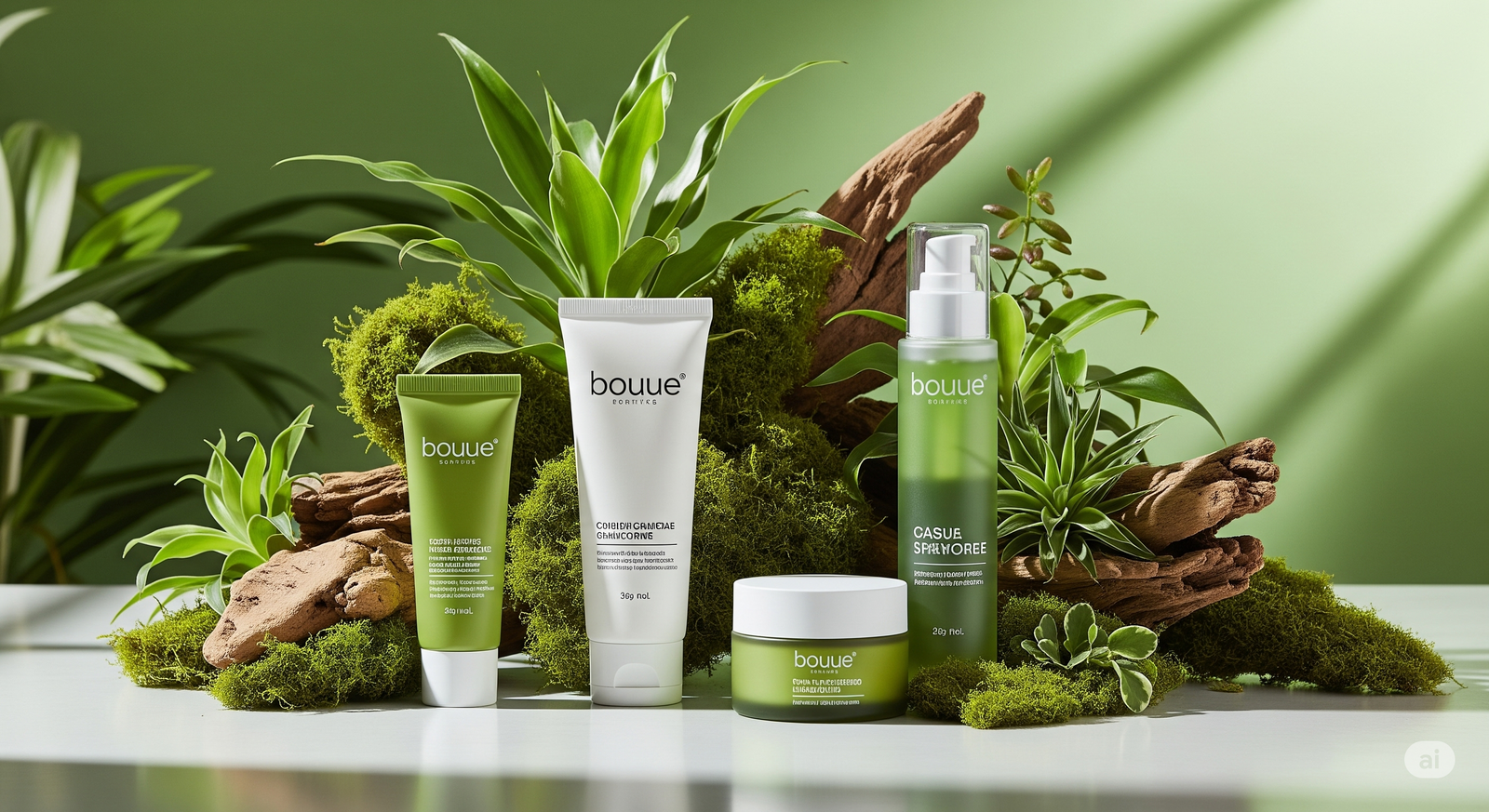
Skincare Brand Stories Without Faces
Here’s a key shift: not every beauty story needs a human face. Especially in skincare, where the focus is increasingly on formulation, packaging, and tone.
By removing people from the frame, the brand gains control over tone and aesthetic. The visual becomes more universal. More considered. And oddly more intimate.
A bottle slowly rotating against a textured backdrop. A lid unscrewing with a soft twist. A pipette drop that stretches just long enough to satisfy. These are the stories being told now. And they work.
Because they don’t rely on relatability, they rely on resonance.
Admigos: Animates aesthetic attention by crafting beauty product motion visuals that center the product without losing story. Through restrained pacing, refined tone, and presence-led storytelling, Admigos helps skincare brands create visual experiences that feel elevated, intentional, and quietly unforgettable.
From Box to Vanity: The Beauty Journey in 5 Seconds
Showcase skincare journey reels with clean transitions and product story animation that move your product from unboxing to vanity in 5 seconds.
Beauty Products as Objects of Desire | Desire-Led Skincare Animation
Discover how slow-motion gloss, hero lighting, and symbolism turn beauty products into objects of desire.